ON THE RUN PACKAGING
Private-label packaging refresh for Sunoco's On The Run snack categories, designed to improve shelf visibility, appetite appeal, and brand consistency across multiple SKUs.
- Role
- Senior Designer, Rodmell & Company
- Client
- Sunoco / On The Run
- Completed
- 2025
- Team
- Creative Director: Mike Woodgate, Marcus Nilsson / Copywriter: Francois Baillargeon / Account Team: Cristina Docanto, Roman Lehecka
- Scope
- Packaging Design, Private Label, Food Photography Coordination, Photo Retouching, Product Comps, Production Artwork, Print Production
- My Contribution
- Supported the packaging refresh across key snack categories, including maple nuts, peanuts, popcorn, and gummies. Contributed to package design, coordinated product photography, retouched and composited final product imagery, and prepared production-ready artwork for print.
Project gallery
ON THE RUN PACKAGING visuals, applications, and production details.
Overview
Sunoco's On The Run private-label packaging refresh was developed to create a stronger and more unified presence across multiple snack categories within convenience retail.
The business objective was to improve shelf visibility, strengthen brand consistency, and create packaging that could compete more effectively in a fast-moving retail environment. Each SKU needed to feel part of the same On The Run family while still clearly communicating flavour, category, and appetite appeal at a quick glance.
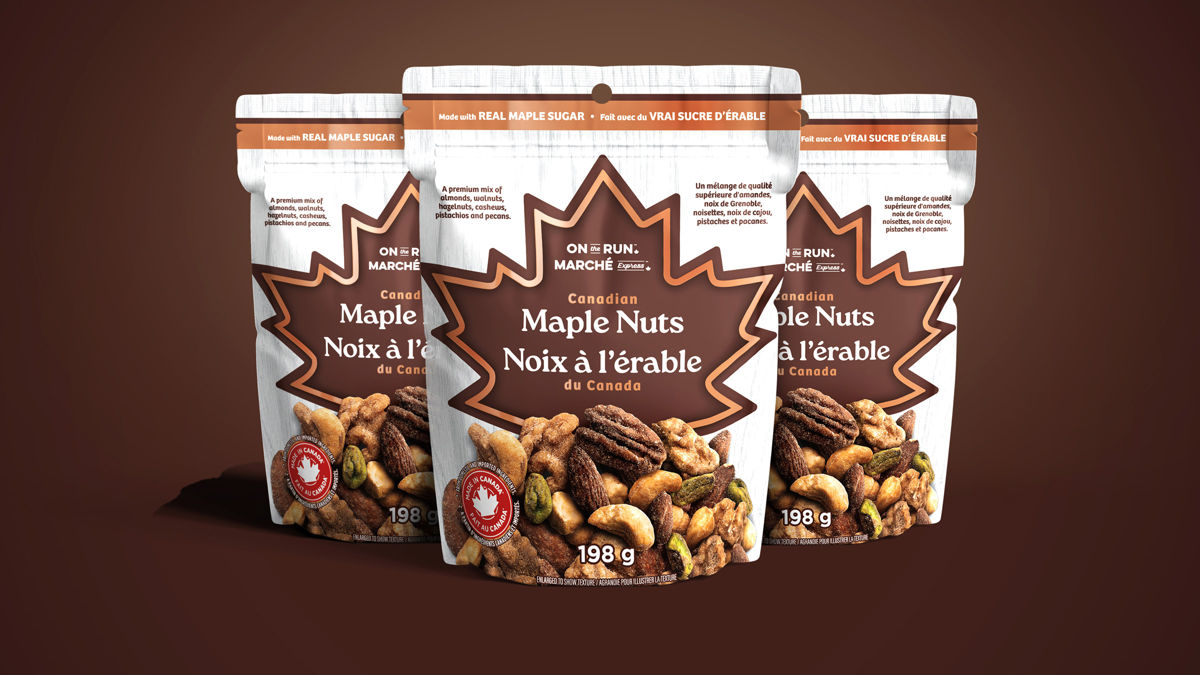
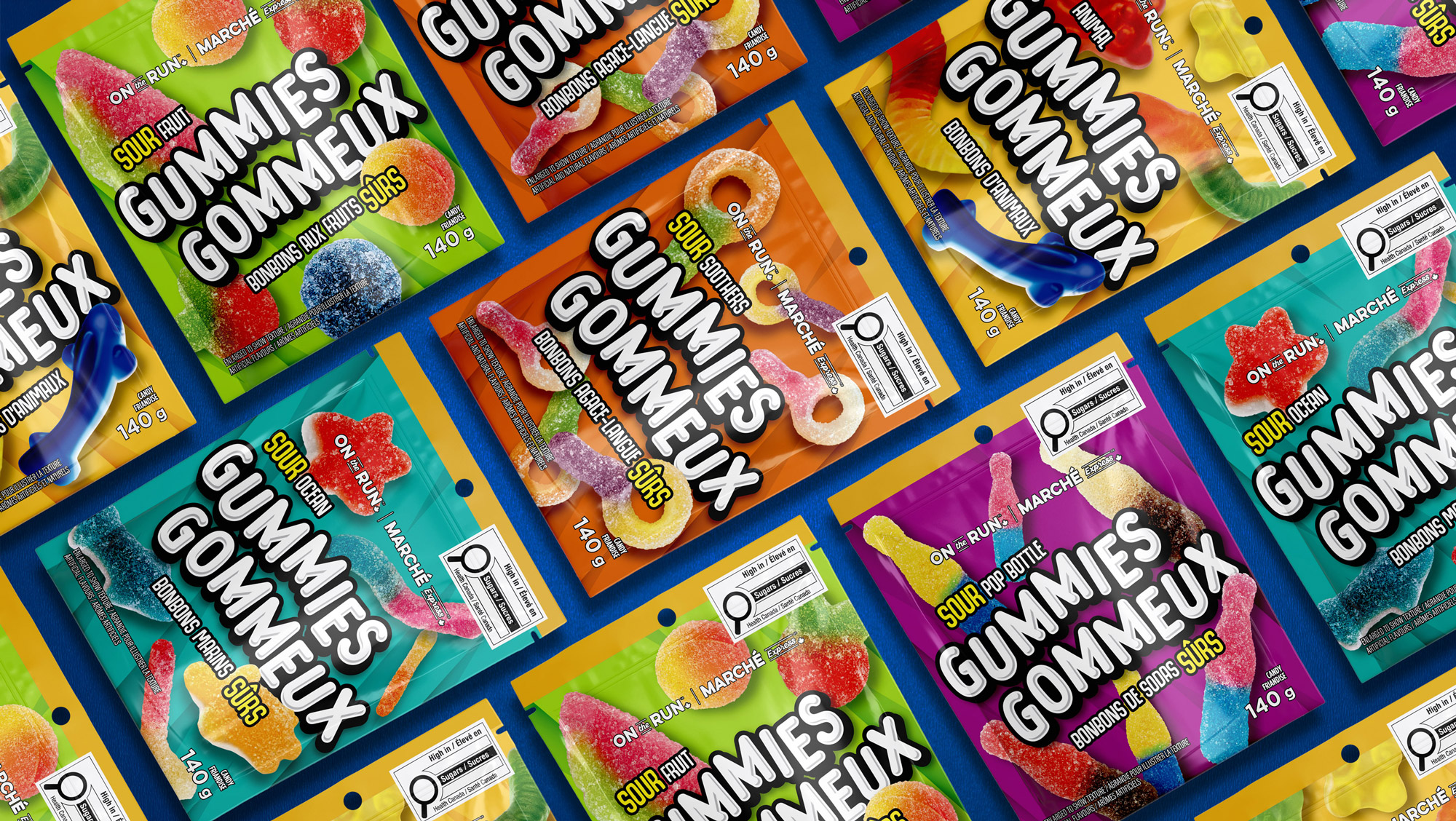
The challenge was to balance brand cohesion with category-specific expression across products such as maple nuts, peanuts, popcorn, and gummies.
Direction & Approach
The creative direction focused on putting flavour and product appeal at the centre of the packaging system. Bold colour, clear flavour hierarchy, and expressive ingredient imagery were used to make each SKU easier to shop and more visually engaging on shelf.
For the gummies, the system leaned into bright colour, playful product imagery, and oversized bilingual typography to create an energetic candy expression. For the nuts and popcorn, the design emphasized flavour cues, texture, and product clarity through stronger ingredient photography, cleaner hierarchy, and category-specific colour systems.
System Thinking
The packaging system needed to work across different product types, bag structures, flavour variants, bilingual requirements, and production specifications while maintaining a consistent On The Run brand presence.
My role focused on supporting the design and execution of several priority SKUs. I helped develop packaging layouts, coordinated with the photographer for food and product imagery, retouched and composited final product images, built final product comps, and prepared artwork for production.
The work required balancing appetite appeal with technical precision, ensuring the packaging could perform both as a shelf-facing retail product and as a production-ready file for final manufacturing.
Outcome
The refreshed packaging created a stronger and more cohesive private-label presence for On The Run across key snack categories.
The updated system improved shelf visibility, strengthened brand cohesion, and gave each SKU a clearer flavour story and stronger appetite appeal. The project also helped establish a more flexible packaging platform for future On The Run products across Sunoco's retail network.
The work demonstrates my ability to contribute across the full packaging process, from design development and photography coordination to final retouching, product comps, production artwork, and print-ready delivery.